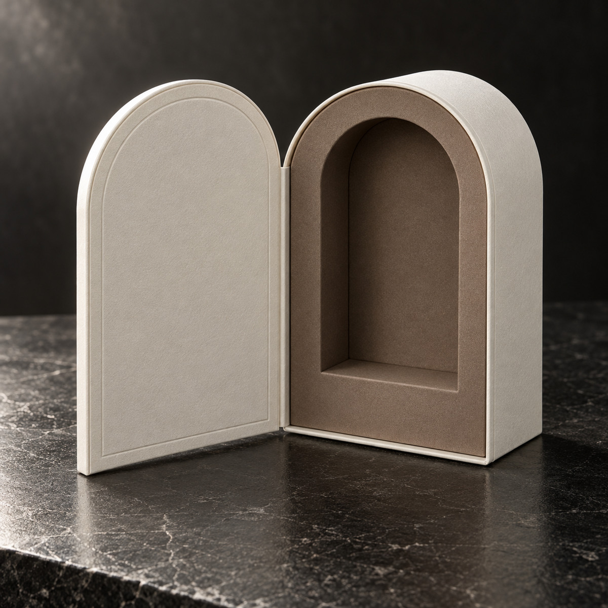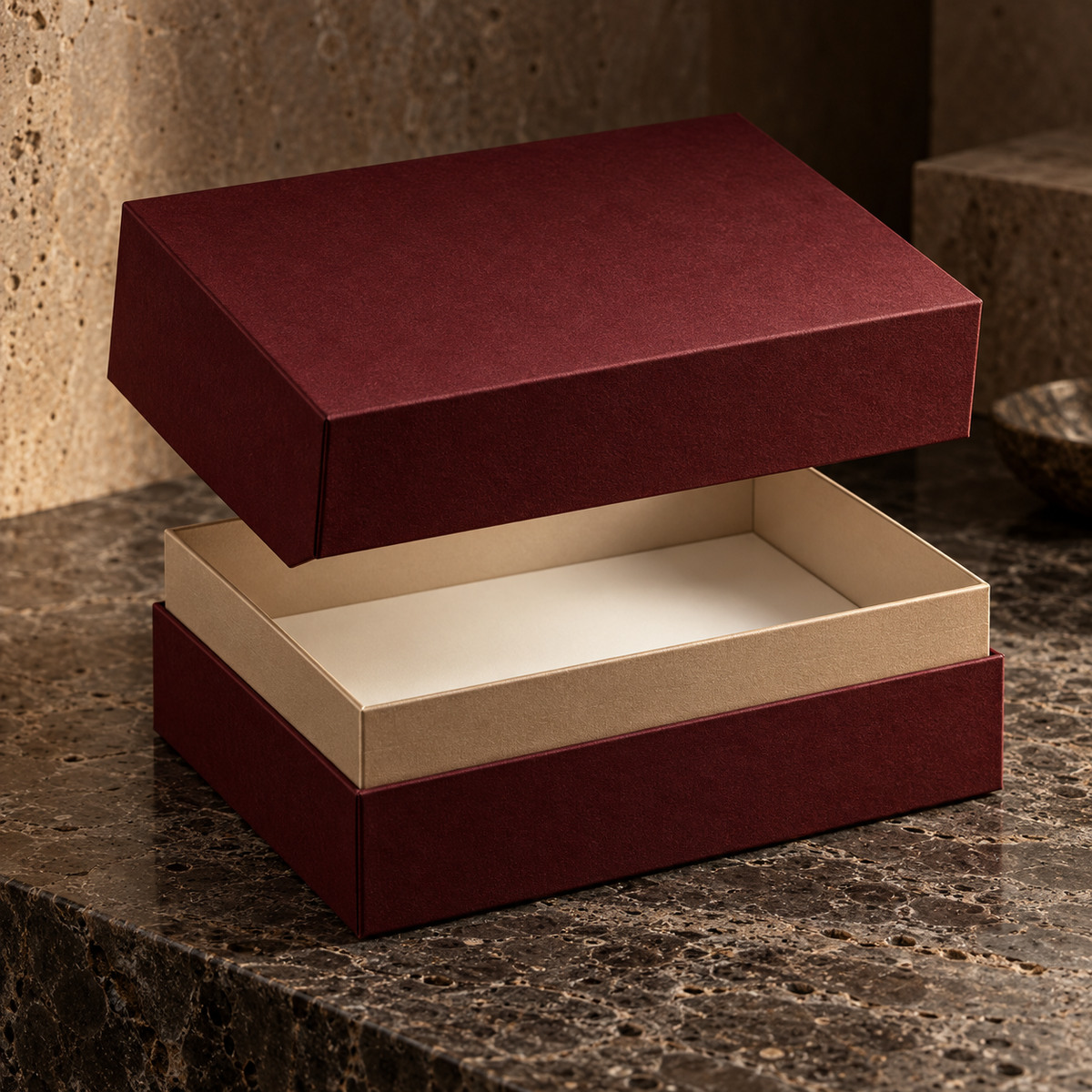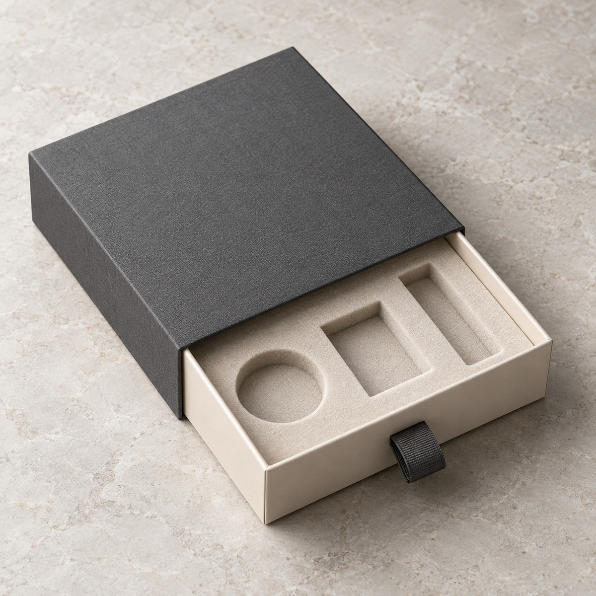
Restrained color systems and tactile materials can strengthen value perception without making the package visually excessive.
Choose a dominant material language
Start with one principal paper or cloth direction, then use liner and insert colors to create depth. Too many unrelated surfaces can weaken a premium presentation.
Control metallic accents
Foil and metallic papers are most effective when coverage, edge distance and registration are designed for the structure. Small controlled accents often produce a more refined result.
Approve under realistic light
Review color and texture under both neutral production light and the expected retail environment. Dark papers, soft-touch surfaces and metallic effects can shift significantly.